- Every piece of text within the elements (
body, h1, p, li, ...) of your website has a font - If you want to change something about the font or text you can select a specific element (using the correct selector) and use the following properties:
| property | example | description |
|---|
font-family | font-family: Verdana; | font in Verdana |
font-size | font-size: 25px; | size of the font is 25px |
font-style | font-style: italic; | italic font |
font-variant | font-variant: small-caps; | Font in Small Caps |
text-transform | text-transform: capitalize; | first character of every word is uppercase |
| | text-transform: uppercase; | font in UPPER case |
| | text-transform: lowercase; | font in LOWER case |
font-weight | font-weight: bold; | font in bold |
text-decoration | text-decoration: underline; | font is underlined |
| | text-decoration: none; | this link is not underlined |
line-height | line-height: 24px; | height of a text line, fixed value of 24px |
| | line-height: 1.5; | line-height = font-size * 1.5 |
text-align | text-align: center; | centers the text |
| | text-align: right; | aligns the text to the right |
text-shadow | text-shadow: 2px 2px 8px #ff0000; | adds shadow to the text |
- The
font-family property specifies the font of an element - The
font-family property can hold several font names as "fallback" system. If the browser does not support the first font, it tries the next font.
body {
    font-family: Verdana, sans-serif;
}
| EMMET instruction | result |
|---|
ff:v + TAB | font-family: Verdana, Geneva, sans-serif; |
ff:ss + TAB | font-family: sans-serif; |
ff:t + TAB | font-family: "Times New Roman", Times, Baskerville, Georgia, serif; |
REMARKS
- To work with fonts in a valid way (without warnings) you need to specify a generic fallback font as the last alternative for the
font-family property
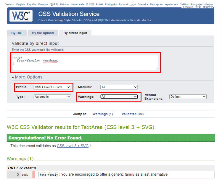
- There are 5 generic fallback fonts which each browsers knows and supports:
serif, sans-serif, cursive, fantasy and monospacefont-family: Verdana, Geneva, sans-serif; -> sans-serif is the generic fallback font
- Fonts without serifs ("sans serif") increase both the readability and reading speed of long passages of text
- Fonts with serifs are often used for more elegant/luxury titles

- CSS Font Stack is a good place to read about how to assemble a good collection of fonts (= font stacks)
- Stay away from
Comic Sans MS if you don't want to be the subject of laughter!
- The
font-size property sets the size of a font
h1 {
    font-size: 50px;
}

h2 {
    font-size: 2rem;
}
UNITS OF MEASUREMENT
- There are numerous units of measurement we can use in CSS. In this course we will only use
px (pixels) and rem (relative to font-size of root element): px: commonly used by web developers and designers (Photoshop) rem- relative length: length is relative to
font-size of the root element (which is the html element, not the body element) - Example: the
font-size of the h2 element is 2rem, which translates to 2 x the browser's root element size (usually 16px)
| EMMET instruction | result |
|---|
fz + TAB | font-size: ; |
fz50 + TAB | font-size: 50px; |
- The
font-style property specifies the style of a font - Possible values:
italic, normal (= default)
p {
    font-style: italic;
}
| EMMET instruction | result |
|---|
fs:i + TAB | font-style: italic; |
- The
font-variant property specifies whether a text should be displayed in small-caps- Possible values:
small-caps, normal (= default)
p {
    font-variant: small-caps;
}
| EMMET instruction | result |
|---|
fv:sc + TAB | font-variant: small-caps; |
- The
text-transform property controls the capitalization of text - Possible values:
uppercase, lowercase, capitalize, none (= default)
.uppercase {
    text-transform: uppercase;
}

.lowercase {
    text-transform: lowercase;
}

.capitalize {
    text-transform: capitalize; /* first character of every word in uppercase */
}
| EMMET instruction | result |
|---|
tt:u + TAB | text-transform: uppercase; |
tt:l + TAB | text-transform: lowercase; |
tt:c + TAB | text-transform: capitalize; |
- The
font-weight property sets the thickness of text - Possible values:
bold, normal (= default)
| EMMET instruction | result |
|---|
fw:b + TAB | font-weight: bold; |
- The
text-decoration property whether decoration should be added to the text or not
.underline {
    text-decoration: underline;
}

a {
    text-decoration: none;
}
REMARKS
- Be careful with removing the (default) underlining of link tags!
- According to the Web Content Accessibility Guidelines (WCAG): If a link is only indicated via color, a contrast ratio of 3:1 between the link color and the surrounding text must be used. This should be accompanied by additional visual cues when hovering over and focusing on the link.
- Reading tips:
| EMMET instruction | result |
|---|
td:u + TAB | text-decoration: underline; |
td:n + TAB | text-decoration: none; |
- Choosing a correct line height improves the readability of a webpage
- The
line-height property specifies the height of a line
Tips
- To obtain a nice layout, a suitable font is not enough. Also the
line-height has to be well-chosen! - Open these examples of good and bad line-heights
- In each of the rectangles you see the same font in combination with a different
line-height - Delete the rectangles (by clicking on them) that you find the least attractive to read, until you have 1 rectangle left
- After that, you will see what most surfers consider to be a good
line-height and how this ratio came about
p {
    line-height: 24px;
}

article p {
    line-height: 1.5;
}
| EMMET instruction | result |
|---|
lh + TAB | line-height: |
lh24px + TAB | line-height: 24px; |
- The
text-align property specifies the horizontal alignment of text in an element - Possible values:
left (= default), center, right, justify
div.center {
  text-align: center; /* centers the text */
}

div.right {
  text-align: right; /* aligns the text to the right */
}

div.justify {
  text-align: justify; /* stretches the spacing so that each text line has an equal width */
}
| EMMET instruction | result |
|---|
ta + TAB | text-align: left; |
ta:c + TAB | text-align: center; |
ta:r + TAB | text-align: right; |
ta:j + TAB | text-align: justify; |
- The
text-shadow property adds shadow to text - Syntax:
text-shadow: hoff voff blur color;
| value | required/optional | description |
|---|
| hoff | required | position of the horizontal shadow; negative values are allowed |
| voff | required | position of the vertical shadow; negative values are allowed |
| blur | optional | blur radius; default value is 0px |
| color | optional | color of the shadow; see Colors |
h1 {
  text-shadow: 2px 2px 5px #ff0000;
}
| EMMET instruction | result |
|---|
tsh + TAB | text-shadow: hoff voff blur #000; |
tsh+ + TAB | text-shadow: 0 0 0 #000; |
tsh:r + TAB | text-shadow: h v blur rgb(0, 0, 0); |
tsh:ra + TAB | text-shadow: h v blur rgba(0, 0, 0, .5); |
DESIGN TIP
- Using the RGBA color system (and a partially transparent color) for the shadow usually gives a better/prettier result, especially on colored and non-smooth backgrounds
- It is very important to not overdo text shadows if you want your website to look modern